Inside Lexifyd: How Lexifyd Makes Learning Stick?
The Lexifyd Ecosystem
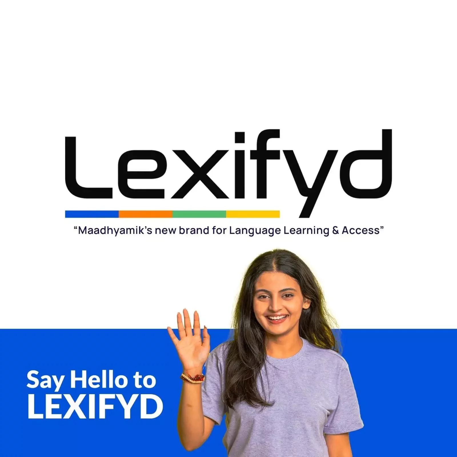
One Unified Brand. Endless Language Access.
Lexifyd is more than a single app—it is Maadhyamik’s flagship ecosystem dedicated to digital script normalization and language empowerment. It's also our brand that represents all we do in language space. The same deep linguistic engineering that powers our consumer learning app serves as the foundational engine for all our access tools.
Lexifyd
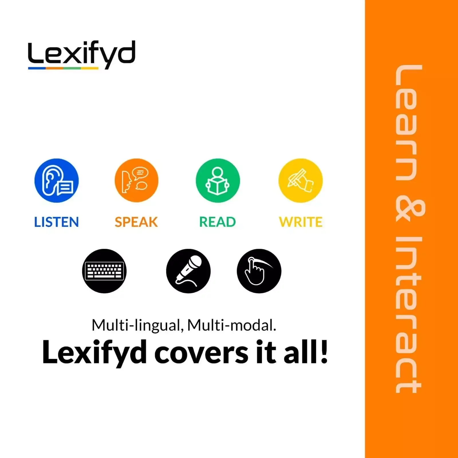
A gamified language learning mobile app that turns mastering native scripts into a fun, interactive experience for children. Available for Android devices on the Google Play Store, it uses ad-free vocabulary puzzles, writing tracing games, and daily cultural nuggets to build reading, writing, and listening fluency.

Varta Keyboard
An advanced, multi-script input solution meticulously engineered to make digital typing intuitive and fluid across Indic languages. Available on mobile (Android, iOS) and web platforms, it enables seamless communication in 8 languages, including English, with slide-to-type and voice typing features.
Tamil Izhai
A dedicated, single-language mobile keyboard app designed exclusively for fast and intuitive typing in Tamil. Available on both Android and iOS platforms, it offers smooth input mechanics, slide and voice typing features, with an optimized keyboard layout, designed using character frequency analysis on a large Tamil corpora.
The Brand
Logo, Typography & Colour Palette
The Lexifyd wordmark is designed based on the Nasalization font—originally inspired by NASA's iconic logotype. This choice is both aesthetic and symbolic. Much like space exploration represents boundless discovery, Lexifyd stands for pushing boundaries in how we learn and use language. It’s a subtle tribute to curiosity, progress, and reaching beyond limits—whether linguistic, geographic, or generational.
The font’s sleek, futuristic lines reflect our tech-forward approach, while its rounded geometry ensures clarity and warmth across diverse scripts. In this way, it becomes a visual metaphor for our commitment to multi-lingual and multi-modal expression, accommodating everything from typed input to spoken interaction.
The colors in the bottom palette symbolizes the foundational language skills but also evoke the emotions and cognitive states associated with each, enhancing the overall learning experience.
Our Values
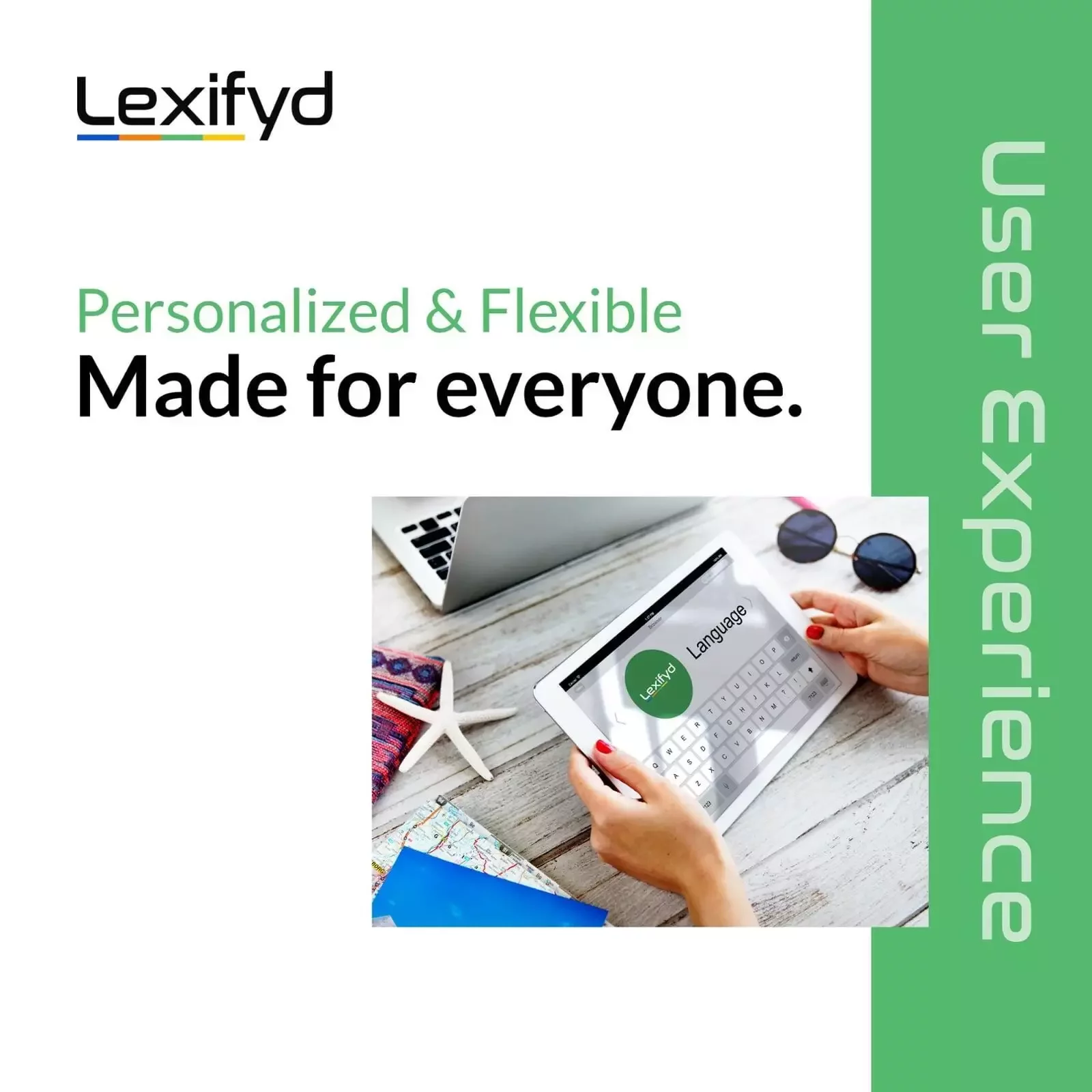
At Lexifyd, our mission is to make language learning and access more intuitive, inclusive, and impactful. We are guided by the following core values:
- Inclusivity: Designing multi-lingual tools that cater to diverse linguistic and cultural backgrounds.
- Accessibility: Multi-modal solutions usable by individuals of all ages and abilities.
- Innovation: Leveraging cutting-edge technology to create smooth, responsive, and seamless language input as well as language learning experiences.
- Immersive Learning: Fluid and intuitive design, with rich graphical elements for engaging and effective interactive learning.
- Cultural Respect: Honouring and integrating the richness of various languages and traditions into our platforms.
These values drive our commitment to creating products that not only teach languages but also celebrate the diversity and depth they bring to our global community.